7 Ways to Make Your Home Look Cohesive Using Scandinavian Design
Most of us know what we do and don't like when shopping for homeware but then struggle to have it all come together as a whole, winding up with a more fragmented aesthetic. See how Scandinavian designers use rhythm, color, texture, and shape to bring a cohesive look to interiors.
- Understand Color Theory
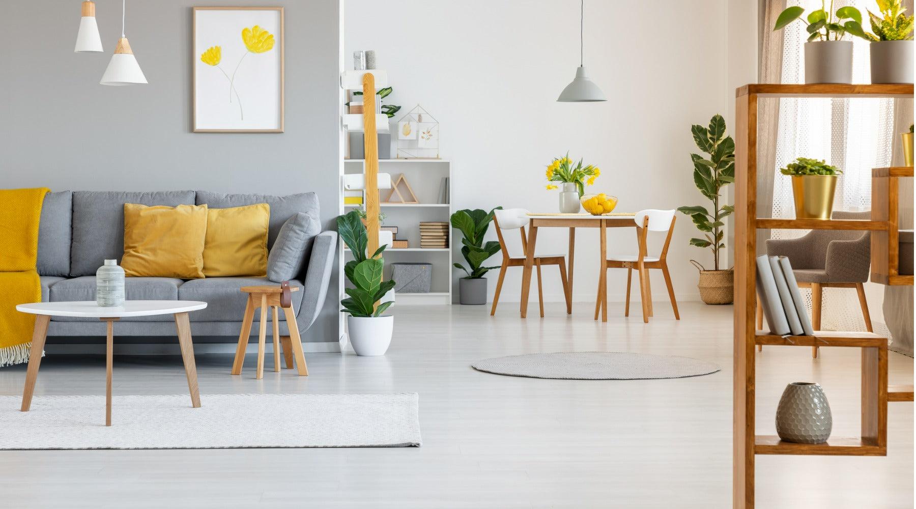
Choosing a color scheme for your home is one of the best things you can do to ensure a cohesive look. Monochromatic, analogous, and complementary color schemes are three of the most common; explore these—and more—with Adobe Color, where you can also create a color scheme from an imported photo. Once you’ve chosen your colors, however, be sure to mix up the shades—otherwise, your space might end up looking stiff and overly formal. For example, if blue is one of the colors in your palette, play around with sky blue, navy blue, and royal blue for a fresh and varied look.
Colors fall into warm and cool categories. In their unmixed form, red, orange, and yellow are “warm” colors, while green, blue, and purple are “cool” colors. However, a yellow mixed with green is considered a “cool” yellow, whereas an orange-toned yellow is considered a “warm” yellow. No matter how diverse your palette, be sure to stick with either warm colors or cool colors.
Scandinavian design is known for all-white color schemes; white, however, is one of the hardest colors to get right, as most “white” shades are actually “off-white.” Off-white shades are either cool (with a hint of blue or green) or warm (with a hint of yellow or red). Accidentally mixing the two will ruin the serene Scandi look you were aiming for, so choose your white wisely.
It’s impossible to identify shades of white on a screen, so shop for white paint and décor in person if you can. Get swatches for your bedding, curtain, and sofa fabrics to take home whenever possible; you can find swatches of our organic linen bedding in our shop.

- Match Your Materials and Finishes
Matching the materials in your home will make it look more cohesive. For example, our organic linen duvet covers will look even better in your space if you pair them with linen curtains and linen lampshades. Match your metals, too—if your bath taps are made from brass, your towel rail and sink taps should be as well.
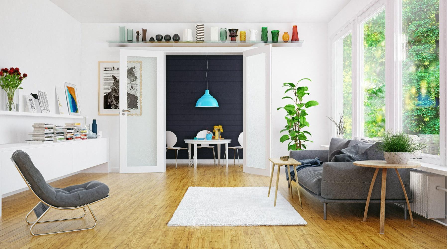
Scandinavian design is known for its use of blond woods such as beech, ash, and pine. These woods have a subtle grain and lack knots or dark markings, making them easy on the eye. Even if you mix several types of wood, however, the result is unlikely to look jarring. As a natural material, wood is more forgiving than synthetic materials; a mixture of woods may even be preferable if you’re aiming for a casual, relaxed style.
Things get more complicated when the wood has been varnished or stained. For a cohesive Scandi look, avoid gloss varnish or unnatural colored stains—stick with wood that’s either unfinished or lightly treated with a matt lacquer.
- Use Complementary Prints and Patterns
We’ve got a whole blog post on using prints and patterns in the bedroom, and the same principles apply throughout your home. Pick one bold pattern to act as the focal point—perhaps our printed Scandinavian design bedding—and anchor other prints and patterns around it.
- Brush Up on Design History
For a cohesive home with minimal effort, collect furnishings from the same Scandinavian design era. Design movements—such as mid-century or Swedish Modern—are rooted in the values of those times, so pieces from the same era tend to look harmonious when paired together.
Don’t ignore the history of your home; find out when it was built and the prevailing design style during that time. You don’t need to copy it to the letter but you might take inspiration from certain elements, such as a repeated shape or pattern.
- Pare it Back
Scandinavian design and minimalism are close cousins: both favor a spare, simple look, clear of clutter and extraneous elements. A minimalist mindset will help you to keep your space cohesive as the less you own, the less that can go wrong. The more décor you buy for your home, the greater the chance that you’ll accidentally purchase something with a slightly mismatched color or finish.
- Spread it Out
When designers talk about “rhythm” in interior design, they’re referring to the regular repetition of elements throughout a space. Whatever you’re repeating—be it color, texture or shape—don’t clump those items in one corner. Instead, spread repeated elements out throughout your home: for example, you can match the bird artwork of our Fugle organic linen bedding with bird-themed artwork or cushions elsewhere in the home.

- Look Around
In architecture, the term “isovist” refers to everything we can see from a certain point. Rooms don’t exist in isolation; we often leave doors open so that the next room is visible from the one we’re standing in. And yet, we often think of different rooms as separate “projects.”
To see isovist in action, stand in your hall with all the doors open and ask yourself whether everything you can see looks as if it belongs to the same home. You don’t need to continue the exact same color scheme or materials from every vantage point but there should be an identifiable theme—mid-century shapes or warm colors, for instance.
If you’re truly stuck on a design problem, try taking a picture on your camera or phone and looking at that instead. There’s something about seeing your space in two dimensions that makes design problems (and their solutions) obvious in a way that three dimensions doesn’t.
How do you make your home look cohesive? Will you be trying out any of our design tips? Let us know on Instagram, Pinterest, Facebook, or Twitter!


